

Every Day Is a Step Outside Your Comfort Zone: Joschka Sawatzky on Small Business Resilience
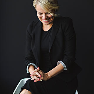
In this week’s 6Qs with Christine, Joschka talks about starting his design career making album covers for his high school punk band, the tough business decisions that reshaped Apricot Creative Studio last year, and the hidden prohibition-era tunnels behind one of his favourite local haunts.
Design work by Joschka Sawatzky
The first time I came across your work was the Boathouse rebrand. Having grown up in Kitchener, it immediately caught my attention because that building has been part of my life for as long as I can remember. When you’re redesigning something that already means so much to people, how do you decide what to preserve and what to reinvent?
Great question! I deal with this all the time as a good chunk of the work I do centres around redesigning existing brands with plenty of established equity, so it’s a constant question I ask myself as the work gets developed. While it’s a nuanced process that ultimately comes down to the specifics of the project at hand, if I had to boil down the “how” to a single word I’d say that would be research. It’s super important for me to understand why the redesign is happening in the first place and what kind of context it already carries with it in order to determine the direction it should evolve into. I grew up here in KW as well, so that responsibility is amplified even more when I myself have a personal connection to the brand.
The Boathouse redesign was a great example of this — the venue’s been around for decades (over 130 years if you count its previous life as a lakeside boat rental shop and snack stand), so it obviously has a ton of emotional relevance within the community. That connection doesn’t necessarily rest solely on a logo design though; I think what folks have loved about The Boathouse most of all is its picturesque Victoria Park location and longstanding live music programming — really the experiences they’ve had visiting it throughout their lives. That ethos and foundation was not changing with the new ownership, and the vision was more so about overall improvement than a complete pivot into a different direction. So from a branding perspective, our goal was to develop stronger storytelling mechanisms that honour the history of the property and bridge the gap into its newest iteration. We needed to preserve the context of a legendary live music venue tucked into the park, and do so in a way that could speak to both existing and new audiences equally to better tell the story behind the property. This eventually manifested itself through the new design system — we brought in a ton of archival imagery and concert photography to form a graphic language that could be applied to various physical and digital touchpoints, which placed the history of the venue at the centre of its visual communications. For the actual logo suite, we had the opportunity to pull in some new references and inspirations from the client side; they wanted to revisit the former Boathouse logo (which was a simple wordmark primarily known via a simple sign at the entrance) and incorporate design cues from iconic Art Deco venues like Radio City Music Hall, the vibrant neon signs of Nashville and Memphis, and the beloved, grungy dives of downtown Toronto’s music scene. This brought us to a newly designed wordmark featuring Art Deco-inspired letterforms with a hand drawn signature B accent, and an accompanying brand symbol enclosed in a guitar pick that that places Victoria Park’s famous resident swan Otis at centre stage.
So while the visuals of The Boathouse’s new brand were certainly a departure from what came before, the through-line from the past to the present became the anchor of the redesign. We had to retain the essence of the venue’s place in the community and what made it special to people, while introducing a new design system that could more effectively tell its story in a contemporary environment. From the ground floor, our research process was the key ingredient to understanding and conveying that history through the new brand designs.
When you’re meeting a new client for the first time, what are you listening for?
Perspective and passion. I work with ownership and key decision-makers directly to understand as much as I can about their business and goals, and use that information to align on a shared vision for the project outcome before we even start sketching. I want to learn about their frustrations as much as their wins — there’s generally a reason behind a company engaging a design professional, so it’s my job to figure out what their current barriers are and how we can develop solutions that achieve the best possible results. No one knows a business or brand better than the people behind it, so I see their perspectives as a crucial component of any project I work on.
Passion also plays a huge part here; these early conversations often uncover deep-seated nuggets of context and inspiration, and sometimes people are so personally invested in their own brand that these bits and pieces only come to light after some creative prompting and conversation. Ideally that passion extends into the working process as well, I find that the best projects are a result of a successful collaboration between client and creative. Every part of my process, from initial discovery to design development to feedback cycles, benefits hugely from direct client involvement and productive communication.
You wrote that your team spent the year pushing yourselves outside your comfort zones. What was one of those moments, and what did it teach you?
I think this is in reference to a post I made at the end of last year, which was probably one of our most challenging years as a studio to date. It’s no secret that the creative industry has its ups and downs, and to speak candidly, 2025 was a tougher year than others for us. I think tightening economic conditions and the rise of generative AI definitely played their parts, and we had to make tough business decisions to ensure the survival of our little studio. We downsized our internal team back into our original 3-person founding squad, and explored new services and processes to bolster and refine our capabilities as a studio beyond what we had been doing since Apricot’s inception four years ago. I’ll venture to say that as a small business owner every day is a step outside of your comfort zone, but in 2025 those steps became leaps as we adopted new skill sets and ways of working that we hadn’t really dipped into as much in the past.
What was born out of necessity became a true propellor of how our studio functioned as we looked to the future, and this was the true blessing of the process. Not only were we able to start offering a more holistic approach to brand building, we were able to do so in a way that brought on the talents of other creatives in specific use-case scenarios, ultimately leading to stronger work overall. We moved from an entirely in-house production structure to a hybrid of internal and contracted work, which meant that we could tap in designers, illustrators, animators, developers, photographers, videographers, and other creatives where their specific contributions would truly elevate the outcome of a given project. Apricot transitioned from a “Jack-of-all-trades” approach to creative services into a more focused and purpose-driven branding studio that sees tactical applications as a trickle-down of a larger vision. For myself as the creative lead, I’m able to oversee that vision from the ground floor and still get my hands dirty in development, while working directly with other amazing folks that lend their touch to execution.
Who influenced the designer you’ve become? It doesn’t have to be another designer.
I’ll answer this one as a two-parter — first as to why I do the work that I do, and secondly as to my biggest stylistic inspiration.
I’d say the biggest influence in my career overall has been the people and community around me. In a past life as a punk rock teenager, I started my design endeavours out of necessity when my high school band needed things like album covers, merchandise, and websites without actually having any money to pay a professional for them. I taught myself Photoshop and basic HTML coding on my parents’ old desktop PC in the early 2000s, and made everything from t-shirts to MySpace layouts as music continued to be my life’s main focus. That soon led to working with other bands I knew, first locally and then from all over Canada and the US, and I started to see how design could become a viable career path. Naturally from there I began to look for other ways to apply my new passion to areas beyond the music industry. I’m lucky to have grown up among tons of entrepreneurial friends that were starting businesses of their own, so branding and communication design became my focus. My biggest highs came from seeing something I made in my bedroom come to life on a storefront or retail shelf, and that rush continues to this day every time we wrap a project. All said, I wouldn’t be doing what I am today without the amazing people surrounding me.
On a more stylistic note, I’m also hugely inspired by history in the design work I do. Back in 2014 I decided to finally pursue a formal education in the field and earn my Bachelor of Design degree. I had already been working freelance for a while and was quite a bit older than most other students in my program, but I saw design school as the missing link between where I currently was and where I needed to grow as a creative — I wanted to better understand industry-standard practices, learn directly from professionals in the field, and be a part of a broader community of designers that I could geek out with. My first year Design History class was where the first lightning rod struck; suddenly I was inundated with the visual magic of design movements from the mid-1800s to mid-1900s, and I became particularly enamoured with the styles that sprang from Europe throughout these many decades. Soon after I’d come to find my favourite designer of all time, Louise Fili, who has infused her Italian roots and love of historic European graphic design into a body of work that never ceases to amaze me. Her boutique studio has operated in Manhattan since the 80s (I had the opportunity to have my portfolio reviewed by her Senior Designer while on a visit to New York in my first year of school, core memory right there). To this day, Louise’s work is still one of my brightest North Stars of inspiration, and I attribute a lot of my historically-informed style to that fateful first year of school when my eyes were opened to all of the amazing design that the past holds.
If we grabbed a coffee and wandered around downtown Kitchener, where would you insist we stop because the design is just that good?
Truth be told I’m an Uptown Waterloo boy myself, but DTK is a phenomenal place to take in design inspiration. Off the hop I need to mention the many outdoor murals — it’s hard to walk ten steps in DTK and not be in eyesight of a fantastic piece made by a local creative. I love that public art has become so ingrained in our local landscape, there’s a ton of fantastic artists that have lent their touch to spots like Goudies Lane, the Gaukel Block, and the yearly DTK Art Walk. Businesses see blank walls as creative opportunities more than ever before, and I don’t see that energy slowing down anytime soon which is a beautiful thing.
A specific example I’ll throw in the hat (albeit a selfish one, as I made the branding for it a bunch of years ago) is Abel’s On Queen, a traditional barbershop located on the ground floor of the Walper Hotel. This is a prime example of how rich our local history is — the entire brand story of the barbershop is built around the hotel’s founder Abel Walper, where we dug deep into the property’s past to inform the branding of the barbershop. A highlight is the patterned mosaic tiles of the shop floor, which were retained from the space’s original construction and became an anchor for the new shop’s colour palette and general design style. To me, KW has this amazing way of being able to reference a storied past while enticing the modern visitor, and I always love when a business can do this authentically and compellingly through design.
What’s one local business you think deserves a little more love, and what makes it special?
I’m going to list two great local businesses here, not because I’ve worked with them (which I have, and both were awesome to create), but because I feel like they’re still being slept on a little.
First is The Prohibition Warehouse, a restaurant and bar in Uptown that’s located in another historic building and seen many iterations over the past hundred years. It’s definitely a super lively nightlife spot with no shortage of bar hoppers throughout the university school year, but I think it gets chalked up to being a student bar a lot when it actually has a really great atmosphere beyond the parties and DJ nights as well. Delicious food, lovely outdoor patio, friendly staff, all the ingredients for an enjoyable evening out (and speaking from habitual experience, their Tuesday Night Trivia with Alex is bar none in the city). What makes it even more special to me though is the story behind the building — in the 1920s it operated as the Waterloo Garage, which was secretly a checkpoint along prohibition-era smuggling routes with ties to Al Capone himself, where alcohol was stored and redirected into thirsty American counties. When the building was renovated in the 1950s, workers found hidden underground tunnels and bullet-ridden car parts buried in the foundation, further solidifying the property’s shady past. Naturally, we leaned into this history with the branding behind The Prohibition Warehouse which opened its doors in late 2019. This is easily one of my most frequented local haunts that’s been around forever in some form or another, I’d recommend a visit to anyone who hasn’t yet been.
I’ll also shout out another local spot here that deserves high praise: the Gaslight District over in Cambridge. A little further away from the Uptown Waterloo and Downtown Kitchener hubs, but a super unique destination in our region. Located right next to the Grand River in Galt and formerly the site of the Southworks Outlet Mall, the property was fully overhauled a few years ago with new restaurants and a brewery, a large wedding/entertainment venue, on-site condos, boutiques and corporate offices. The real magic, however, comes from the space itself; it’s centred around a public square with an absolutely massive LED screen, an outdoor stage, interactive art installations, and a year-round calendar jam packed with free programming. Live music, artisanal markets, food popups, outdoor movie screenings and sports on the Big Screen all come together to create a lively atmosphere where there’s almost always something happening. I’m listing a lot of things here, but that’s point. HIP Developments, the brains behind the property, have done a phenomenal job of creating an immersive destination driven by community connection without a price tag attached to it. Folks from near and far can come to enjoy family-friendly activities that are rooted in the simple idea of experiencing joy in being together, and it’s a constant pleasure to be able to help shape Gaslight’s on-site and online brand experience. Absolutely a must-visit place in Waterloo Region, whether it’s your first time or your fiftieth.
Bonus Question: What’s the smallest design detail you notice that most people walk right past?
Easy answer here — typography! This is probably where my design nerdiness and OCD shines the brightest, I’m absolutely that person that’s constantly pointing out uneven kerning and problematic letterforms (to the tune of many an eye roll from my friends and family). It’s also where I tend to spend the most time in my own design process. Type is one of those things that can carry such deep meaning beyond surface level aesthetics, I can nitpick for hours finding the little nuances that really make a word or statement sing. Going back to my earlier mentions of design history, typography is very much where that all started from — I can’t tell you how many hours I’ve spent combing the ancient streets of Paris, Venice, Barcelona, and the Bavarian villages where my family is from, ogling at hand-painted shop signs and old printed ephemera. I’ve got thousands of photos in my inspiration bank that I’m constantly adding to, and this everlasting love of letters is always what gives me pause. Everybody else walks right past, but I’m stopping to snap photos and then running back to tell you all about the brushstrokes and mosaic tile accents.
Joschka Sawatzky's approach to branding starts with research: understanding why a redesign is happening and what history it already carries, before a single sketch gets made. That same instinct shows up in how he runs Apricot Creative Studio. When 2025 forced tough decisions, he treated the disruption as information rather than failure, and rebuilt the studio around what that information taught him.
To see more check out the Apricot Creative Studio website: https://www.madebyapricot.com/
This series works because people keep pointing me toward the next great conversation. If someone’s creativity has been inspiring you lately, tell me who they are. I’d love to talk to them next.
Until next week, Christine


